CHOCOLATE BY THE SEA –Visual Identity #2/3
Take a dip in a sea of chocolate!
Autumn, winter, spring, or SUMMER…gotta say “yes” when chocolate calls!
Curious about the latest chocolate bar trends antipod discovered for you? Let yourself be inspired by our summery discoveries in terms of rebranding, visual territory and creative packaging.
#1/3 Smart Rebranding: Rocky Mountain Chocolate
#3/3 Creative Packaging Concept: Callebaut
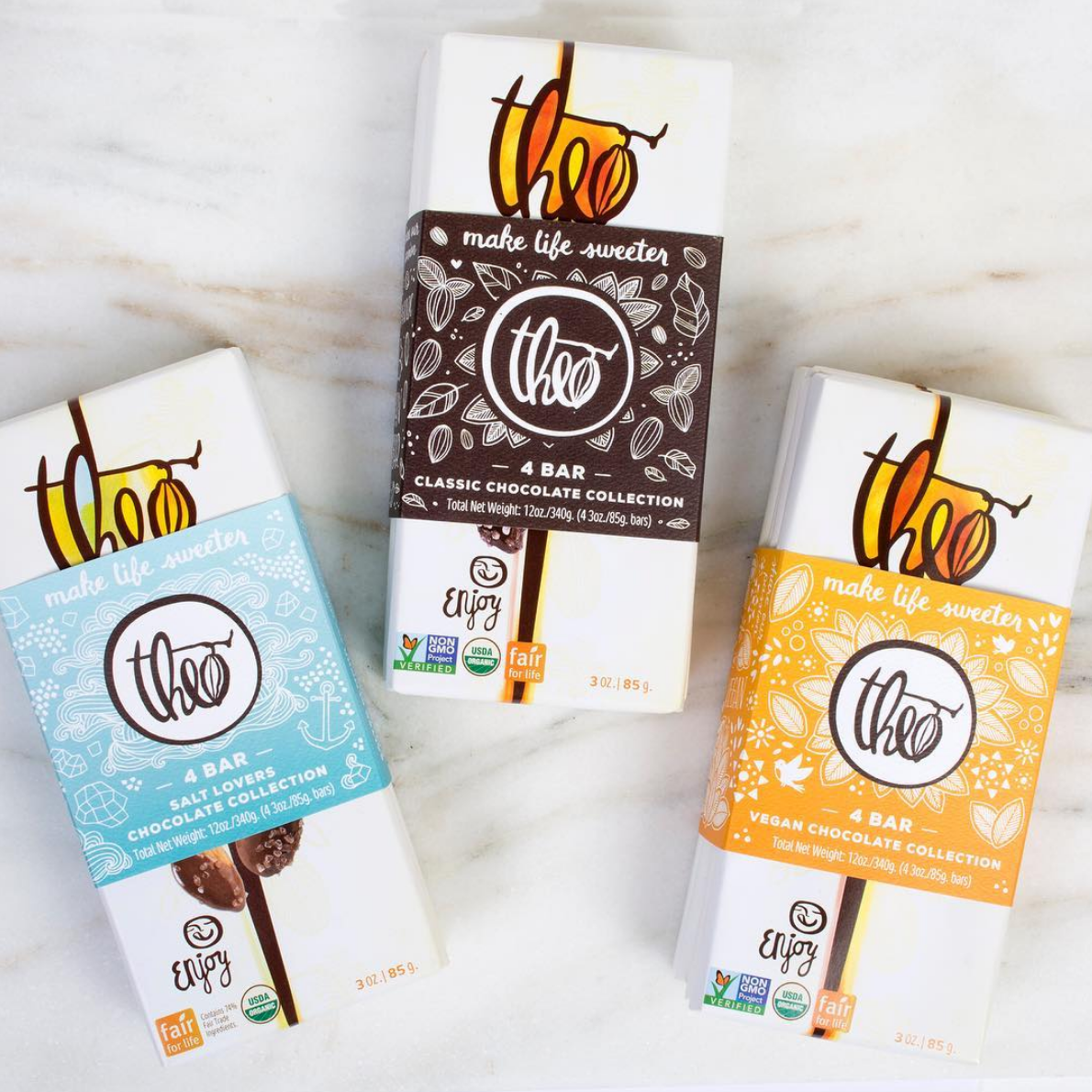
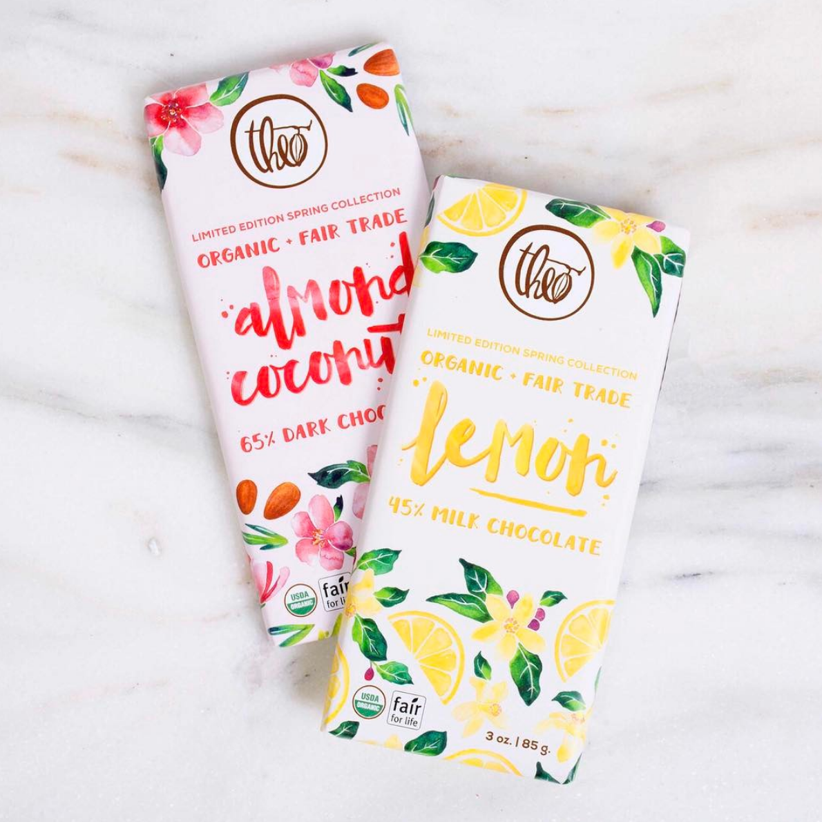
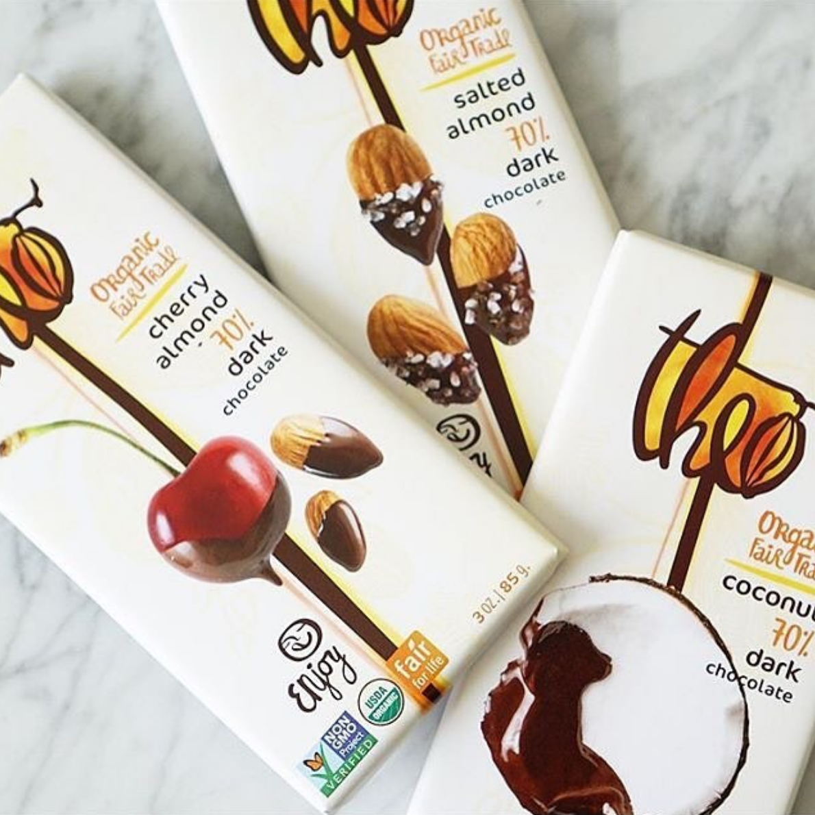
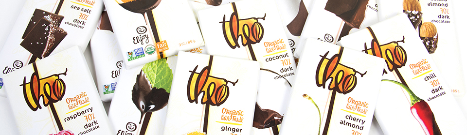
#2/3 Visual Identity: Theo Chocolate
Established in Seattle, Washington in 2006, Theo Chocolate is the first organic and Fair Trade chocolate factory in the United States.
Theo Chocolate is dedicated to make the world a better place by bringing out the best of the cocoa beans. And the brand is just that. It displays in a creative and appealing way the care that goes into each bar, from sourcing beans to packaging.
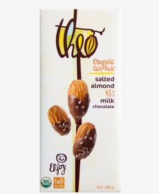
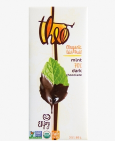
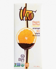
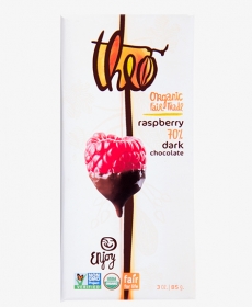
The brand reflects the rich and complex blend of cocoa beans that gives Theo chocolate its character. It sparks the care and precision with which the chocolate bars are made, and the creativity and joy that leads to the unique flavors.
Discover the visual brand representations and creative packaging that inspired us, on Instagram: summer colours and fresh fruits is the perfect combo!