

WHAT’S ABOUT LOGO TRENDS & BRAND IDENTITIES IN 2020?
Did you know that? Even logos and graphic charts follow trends – especially because our digital landscape continues to disrupt rules and visual codes, but also the world of possibilities.
Let us embark with this new article antipod in the exploration of the latest developments of logos, to allow you to think about your own identity projects.
A return to simplicity and essentials
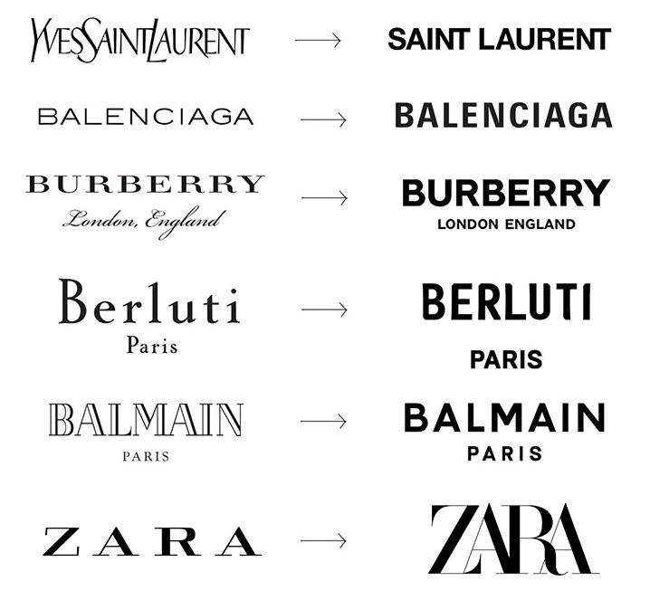
Simplicity, beyond a simple trend, today corresponds to a real philosophy. Many brands have already adopted this bias by simplifying their visual identity, through clean logos and without bulky elements.The details are put aside in favor of simple typographies, shapes or elements that seek to gain visual impact. Not without sometimes losing a bit of personality and soul.
A first striking example here with the simplification – or even smoothing – of the typographic logos of major brands:
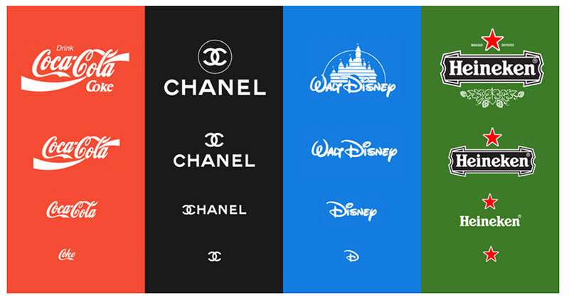
Symbols and pictograms, such as the logos of social networks, have evolved considerably over the years, gradually abandoning their bulky details to become more and more simple and obvious, thus easier to recognize.
![]()
Of course, this tendency towards essentialism also corresponds to a technical reality, the multiplication of possible display formats. The logos, which are lightened with precise details, allow a versatility of variations for all screen sizes, a key point in the constraints of use – and thus become good “responsifs” logos.
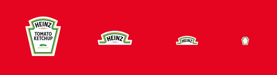
More and more variations
Indeed, to be relevant and adapt to the different formats on which it will be distributed, a logo must be responsive. Brands have understood this, and are having fun today with versatile logos that take various forms and organizations.
![]()
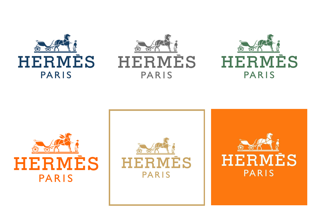
To adapt their visual identities to different themes or platforms, brands also choose to extend their color variations..
This is the case of Hermès which, without modifying the shape, declines its logo in more than 6 different tones.
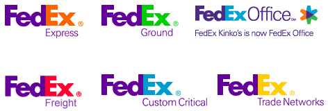
In order to highlight its various services, FedEx has also adopted different colour codes in its variants.
The big brands are not the only ones to dare the variants. A good example here with the Opera and Ballet Theatre of Perm, which pushes the declination even further by mixing colors and inlays of images according to the shows.
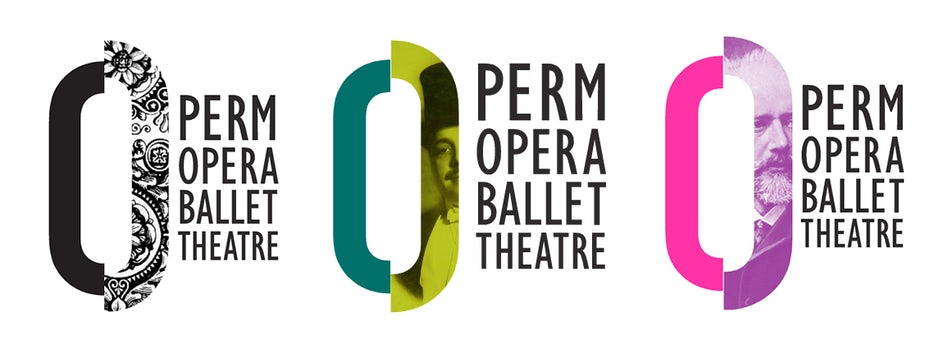
Through this case, and more broadly in art and culture, we observe a certain freedom in the evolution of visual identities. If previously the logos and identities respected precise lines and strict charters, today we can observe more and more variations and an opening of the codes.
Futuristic logos
New technologies open the field of possibilities, even in the world of logos. This year, logos with futuristic trends are very present – animation, 3D or gradient effects (‘gradient’) are current to modernize a logo.
Before the digital age, logos were part of our landscape of still images. Logically, with the domination of digital images and the rise in power of videos, logos begin to come alive as well.
So the Slack logo, for example, comes alive to gain in modernity and visual impact, but also in sympathy capital.
Another emerging trend, 3D is also experiencing great success this year. Many brands in the start-up world have made this choice, thus giving a “tech” dimension to their brand image.
Here is an example with the 3D logo of Ledga, an audit tool based on block-chain technology, made by Bujar Ljubovci.
![]()
Finally, the “gradient” is very popular in graphic creations. This subtle color gradient is found more and more in the background but also in the elements by small touch or for the complete logo.
A first example here with the Firefox logo.
![]()
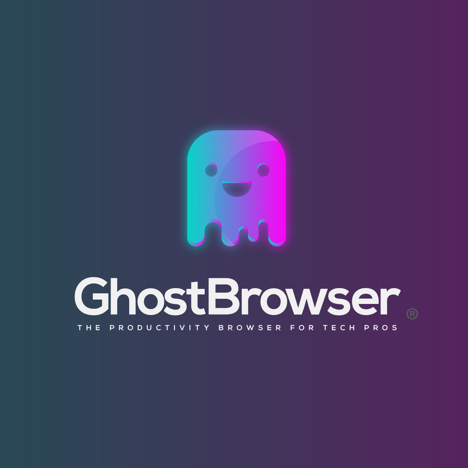
Here a second example with the graphic proposal of Creative Spirit to boost the logo of Ghost Browser, browser for web professionals.
It’s all about typography
If badges, symbols and emblems have long been very present, with the pronounced return of simplicity, everything is played out today on typography. We then see flourishing new typographies, made by hand, or transformed, as different as each other, but always very original. A return to the historical effectiveness of typographical art to communicate the personality of a brand?
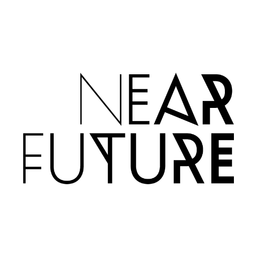
The Near Future community logo, with its bold typography, perfectly illustrates the identity of its community.
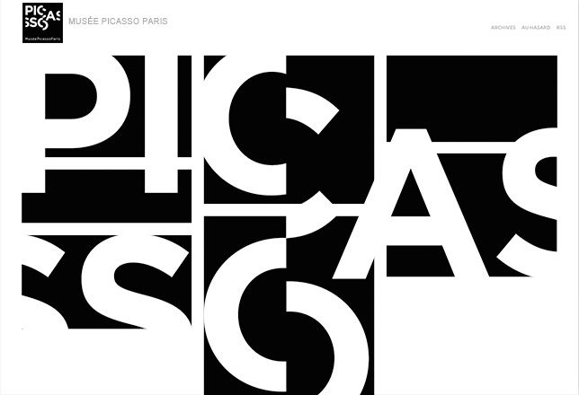
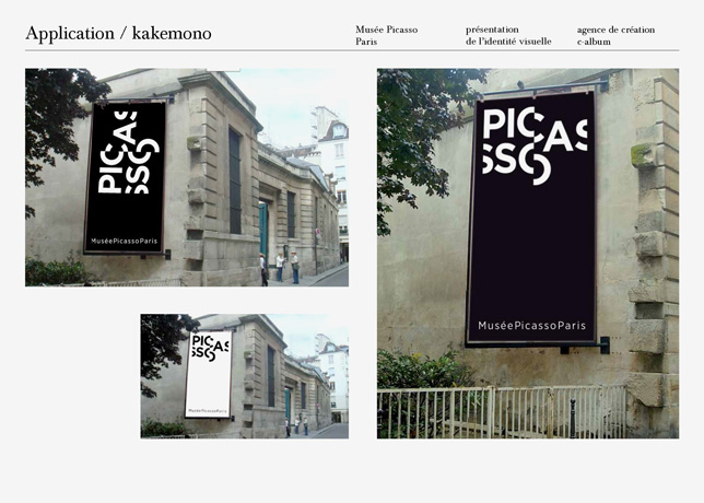
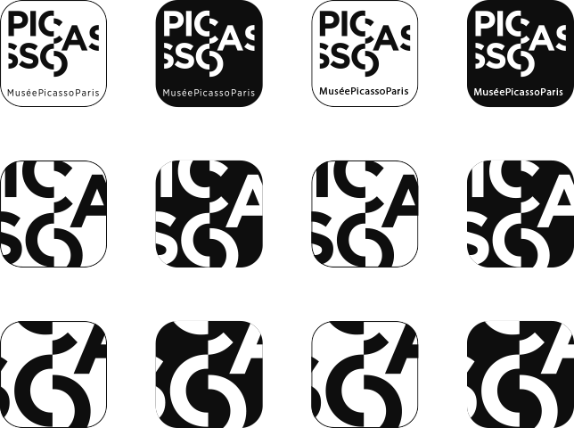
A magnificent example with the visual identity of the Picasso Museum, which changes the layout of its typography according to the display media.
To conclude
In the world of logos there is a certain tendency to simplicity. The challenge for brands is to remain visible, recognizable and impacting in a tide of visual stimuli, regardless of screen sizes.
Result? Logos more immediately seizable, but sometimes simplistic or smooth, like luxury brands that all end up tending towards the same typographies. So to come out of the crowd, other tactics are taking off: resorting to 3D effects, futuristic gradations and especially animations open up new visual perspectives, and perhaps give back to logos what must make their strength above all – a unique personality.
Find out more in our next article: Variations and applications of logos: a new freedom?
Sources :
Graphiste / 99 designs / Webmarketing-com / Creads / Design Shack
Photos & pictures : Graphiste.com / Atelier Julian Legendre / Austin Graphic Design / Blog ai 3 / Le Saint / Hermès / FedEx /99designs / Creads / Bujar Ljubovci / Firefox / Creative Spirit / Near Future / Julien Lelievre /