

HOW HAS THE CRISIS AFFECTED GRAPHIC TRENDS?
With the coronavirus crisis, brands have had to adapt quickly to consumer expectations and behaviors. Marketing and communication have been strongly marked and many brands or agencies refuse a return to “normal”, to advocate a different and more reasoned world.
What about visual communication? What are the emerging graphic and visual trends after the crisis?
The antipod team is giving you an update on our graphic environment with this new article.
A graphic of meaning
We see the emergence of a responsible graphic design, with visuals that call for compliance with health standards during the crisis, and the still current barrier gestures. Visual communication is a strong way to convey messages, with varied tones and approaches.
Many institutions very quickly adopted graphic design, from the simplest to the most worked, to remind and enforce the rules. On the streets, transport and shops, on television and on digital platforms, these responsible designs now seem to be part of the visual landscape.
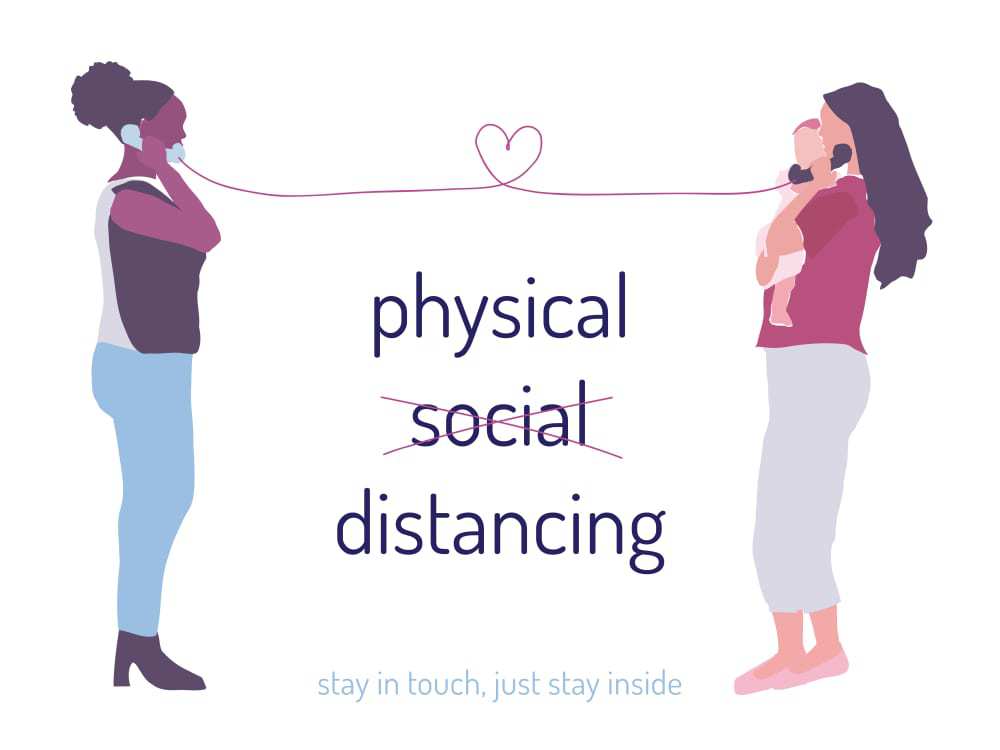
Two examples here, with a first visual shared on the United Nations Twitter account.
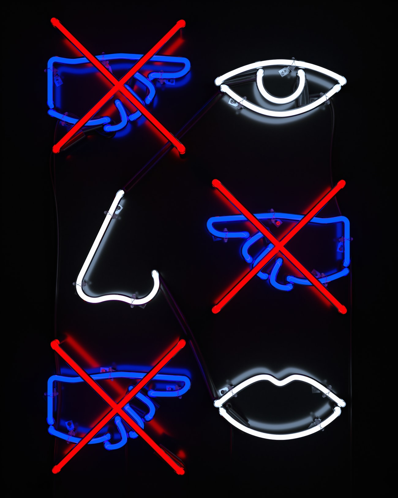
Or this minimalist infographic by Rizon Parein and Mark Sloan for United Nations COVID-19 Response.
While many organizations have used graphics for crisis communication, they are not alone. In the face of the situation, artists, but also the general public, make extensive use of visual creation to express feelings and emotions. In different areas, to express support, fear, misunderstanding, many creations have been created.
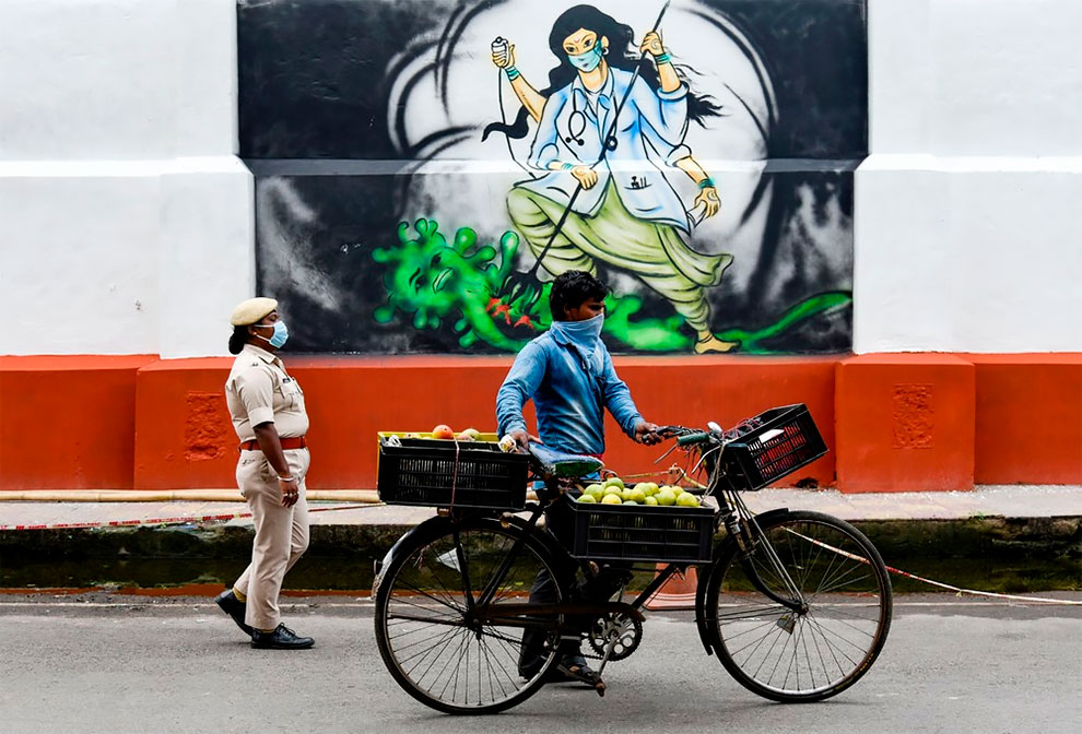
An example here with a work of street art in India, photographed by David Talukdar as a message of support to the nursing staff.
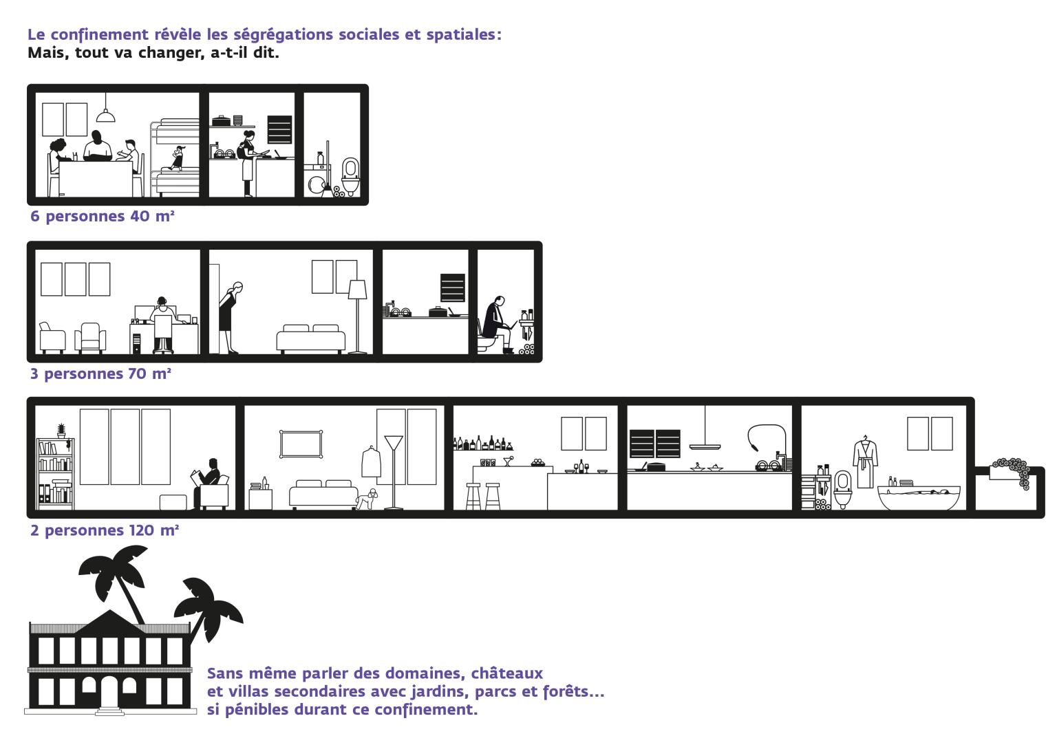
Another example is this infographic by designer Ruedi Bauer that highlights how confinement reveals social and spatial segregation.
More than ever, visual communication is sometimes worth 1,000 words and has allowed many people to express themselves at this particular time.
New and predominant themes
The crisis marked 2020 and new graphic themes appear in relation to it.
Health, the medical field and well-being are the main themes of this year 2020, marked by a difficult start to the year. The world now wishes to highlight the importance of health and well-being in life, while thanking and highlighting the importance of the medical profession in our lives.
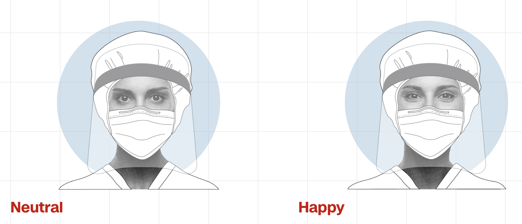
For example, here is an illustration from a very graphic CNN article on non-verbal communication.
Despite the seriousness of the concerns, there is nevertheless a very present optimism and humorous tone.
These 2 posts reveal the creativity and humour of the “Instagrammers” during the crisis.
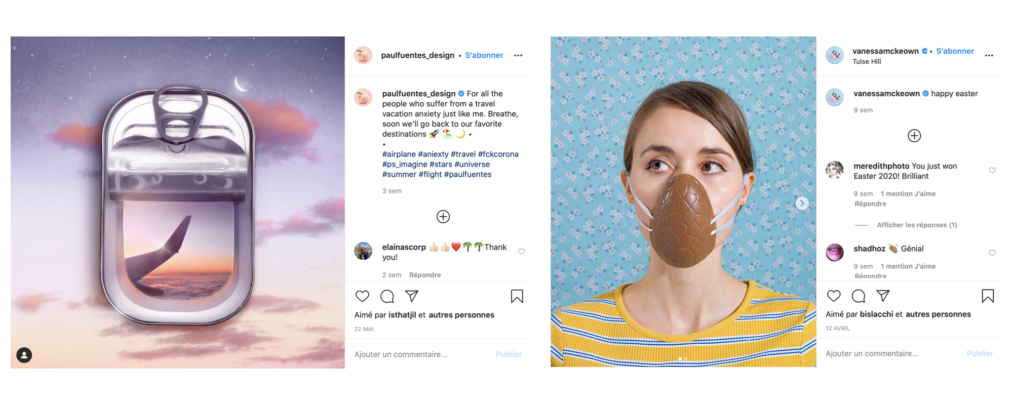
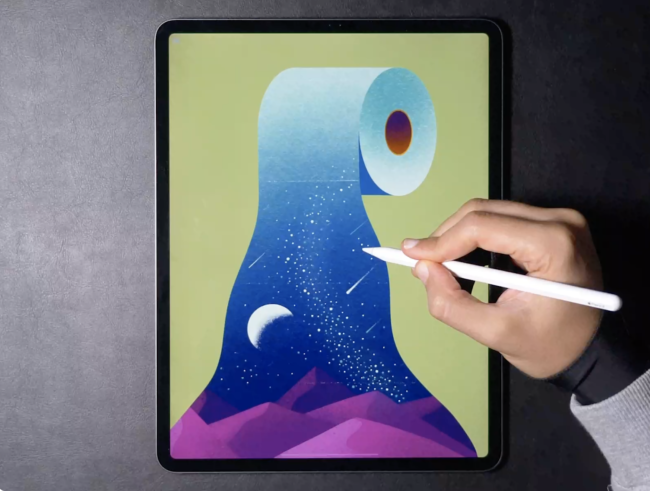
Here, a glimpse of Gal Shir’s timelaps that hijacks toilet paper as an illustration stand. “Lol, this is hilarious to me 😂😂 good job turning pandemonium into something beautiful 😍” comment one of his followers!
See the timelaps
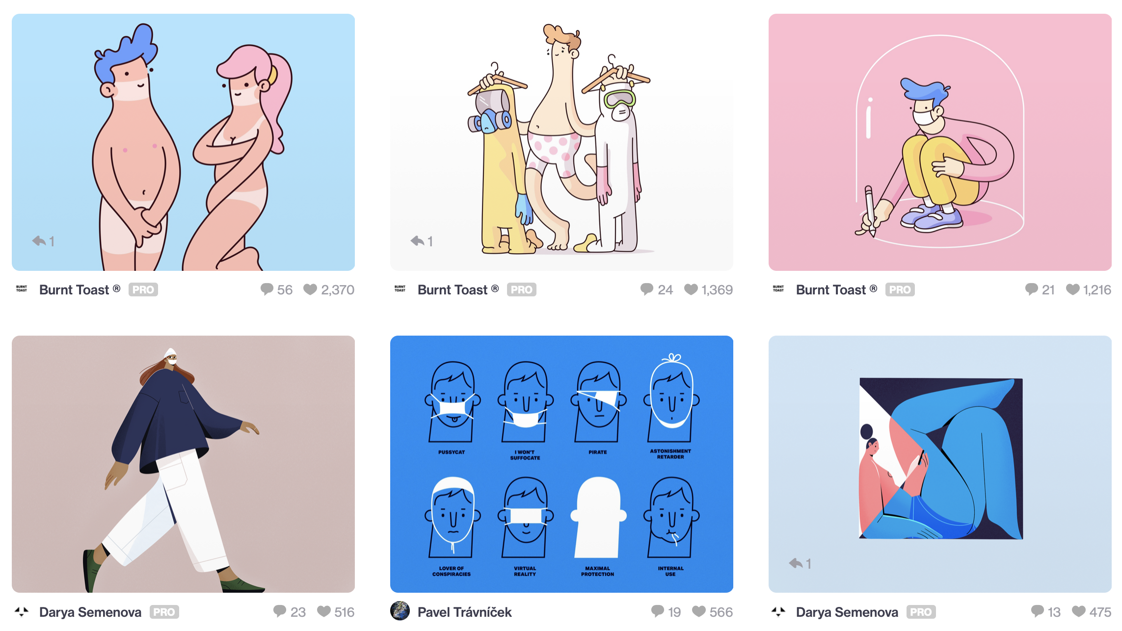
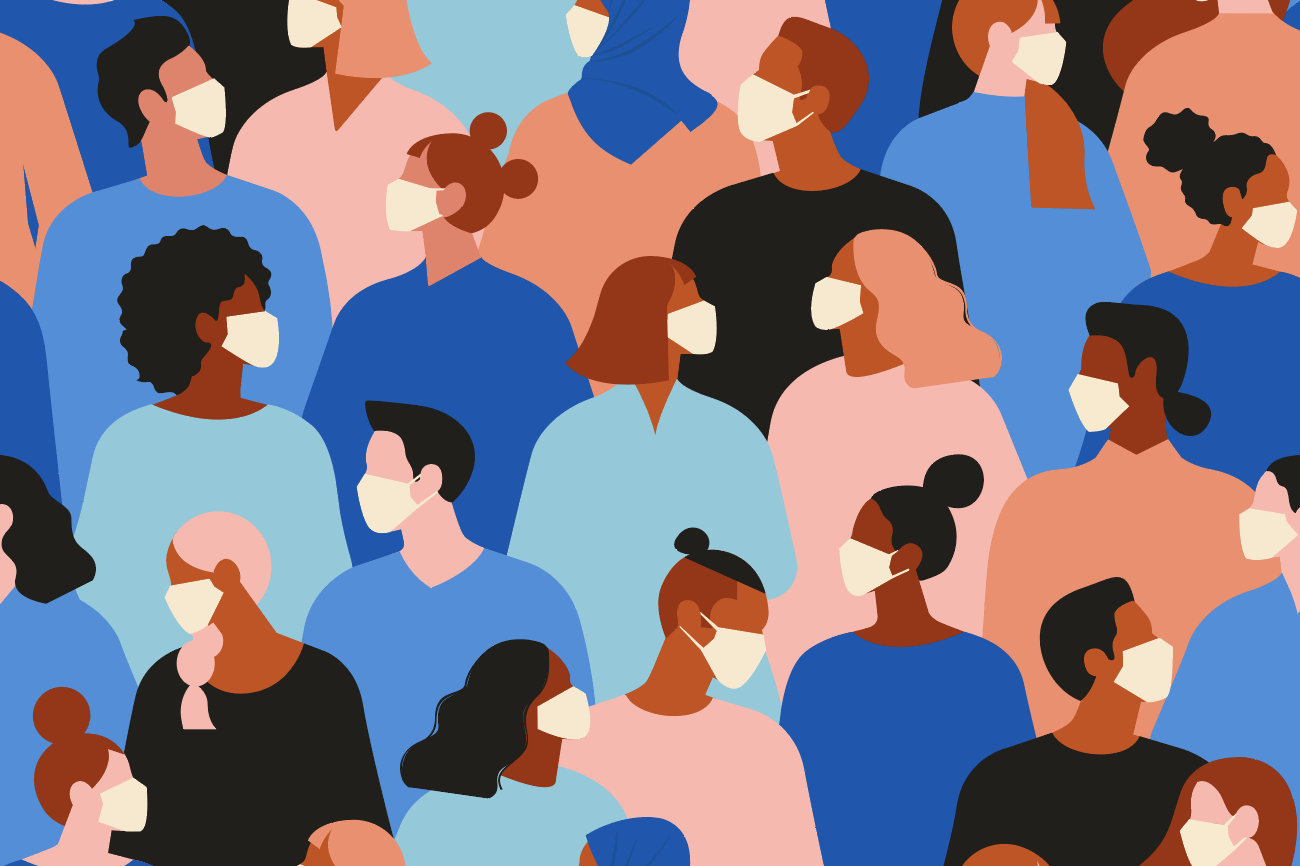
On image bank sites and portfolios, the visuals illustrating medical personnel, gestures to be respected or information related to the situation have exploded since March 2020.
An example here with an overview of the category “Coronavirus” on Dribble.
Despite the reminder of barriers and social distancing, solidarity, union and community are more than ever at the rendezvous. In fact, with the crossing of this particular period, the social connection seems to have become essential, we find it through colorful and dynamic designs, emphasizing the joy of being together, positivity and life.
After the sense, the shape!
If the crisis has strongly marked the meaning of the graphic design, what about the form?
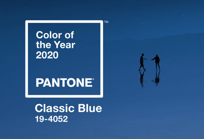
On the colour side, the Classic Blue Pantone was voted the colour of the year 2020, and the crisis only confirmed this success. Representing calm, connection and trust, blue also evokes in our western regions the medical field, health and social connection. A color therefore perfectly in tune with the air of the time.
Once again, the company was right and you will have understood, blue is THE color to use this year!
After this difficult period, optimism is in order and life resumes. This is why the bright colors and very nuanced, recalling the dynamism and the community will also be widely used.
Designs with futuristic tendencies, sometimes semi-surreal and full of contrasting colors, which leave little room for emptiness… This is the trend that seems to be confirmed for the coming months!
An example here is with the Mucinex campaign, a drug brand during the Covid-19 crisis.

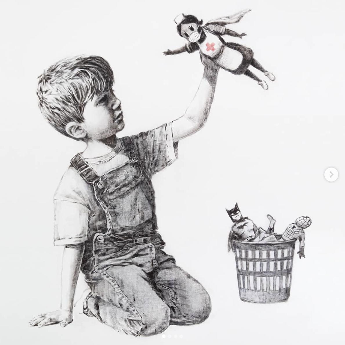
Concerning styles, the “hand-made humanism” also became a great trend during this period, with hand-drawn drawings or illustrations that allow everyone to express themselves, thank or communicate their solidarity.
Here is an example of a post by the famous artist Banksy on his Instagram account.
To conclude
As you will have understood in our latest analyses, this crisis has deeply permeated marketing and communication (see our articles on the subject)- without sparing graphics.
By emerging strong designs of meaning, mixing solidarity, optimism and hope, through dynamic and colorful forms and styles, as to remind that life always takes over.
Sources :
Photos et pictures : JR for Vanity Fair / United Nations / Rizon Parein & Mark Sloan / Rudi Bauer / David Talukdar / CNN Illustration / Tiziana Fabi / Gal Shir / Dribble / Pantone / Mucinex.